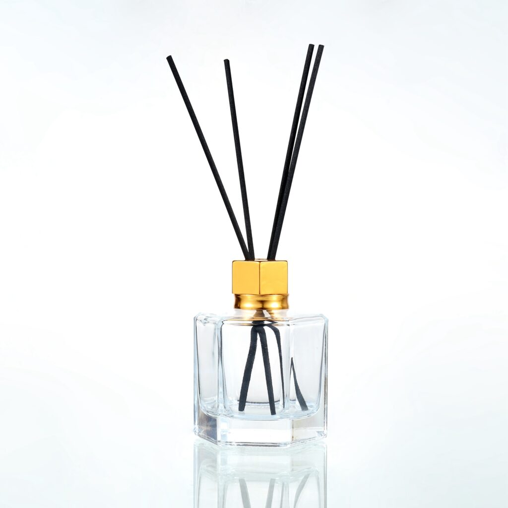

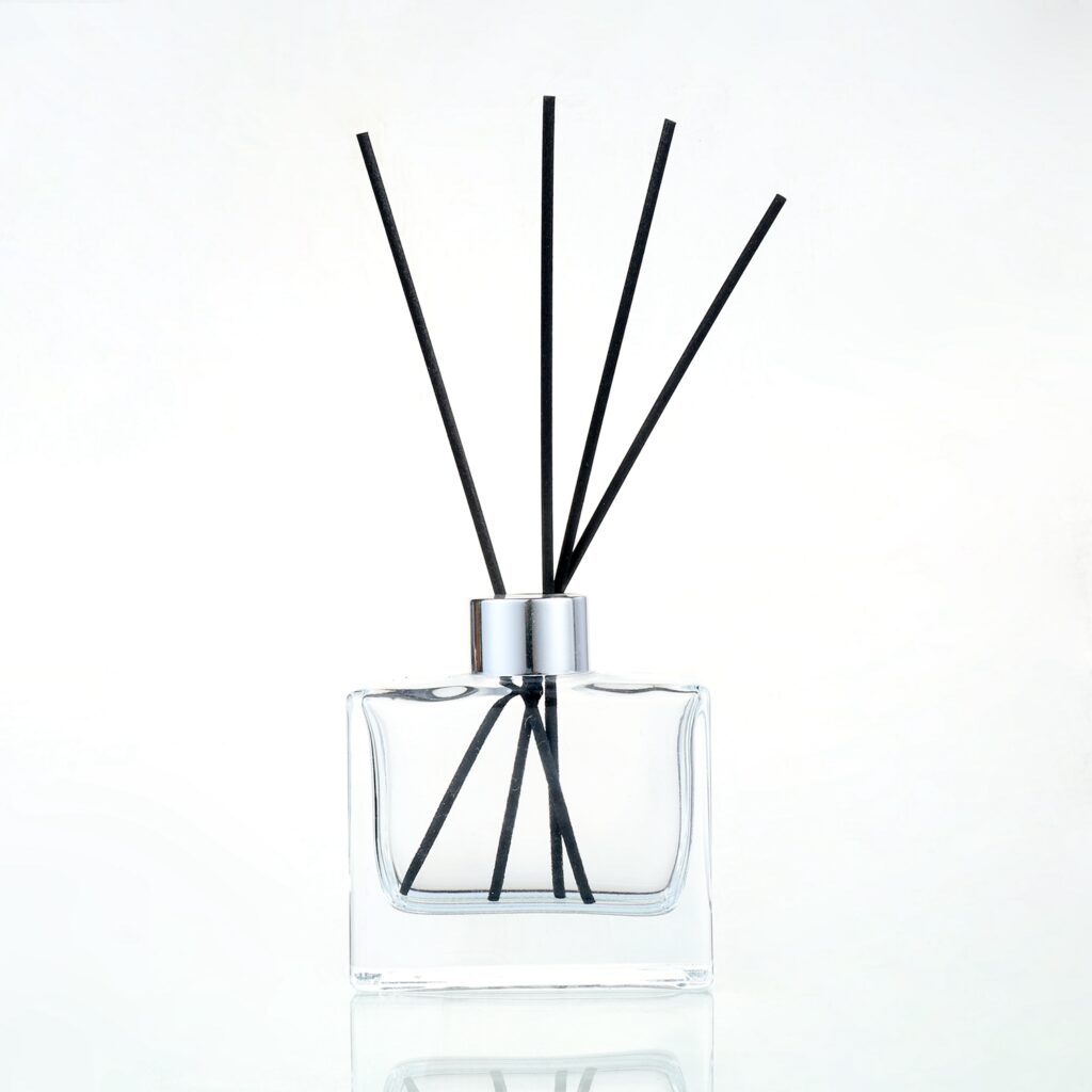


If your brand is going for a more structured, almost architectural look, this is the bottle in our range that fits best. The flat sides give labels a proper flat surface to sit on, which sounds like a small thing until you have tried labeling a curved bottle and watched the print stretch or wrinkle.
We see this shape used a lot by brands with a more corporate or design-led aesthetic, think clean sans-serif labels, muted color palettes, that kind of positioning. It photographs consistently, too, since the flat sides do not catch light unevenly the way a rounded bottle can. The silver cap keeps the top of the bottle understated so the label stays the focus.
The flat square shape also uses shelf space more efficiently if you are dealing with retail display constraints, which is worth mentioning if you are planning to get this into physical stores rather than selling online only.
Key Features
- Flat-sided, square structure with a silver cap.
- Clean surface for labels without stretching or distortion.
- Suits corporate or design-led brand aesthetics.
- Efficient use of shelf space for retail display.
- Custom colors, logos, and decorative finishes available.